
Did you know that by 2020 (an article in the Oct. 8, 2011, edition of The Economist) there will be over 10 billion mobile connected devices? Bear in mind that the world population has just reached 7 billion in October last year. This means we will have more mobile devices than human beings on earth by the year 2020. By next year the most common way to access the Internet will be via a mobile device. This means more and more people are going to expect you to have a mobile version of your website.
Scary thought?
Perhaps, but it doesn’t need to be… It could be exciting! There will be more business opportunities for you. All you need to know is how to participate in the mobile world.
So, is your website mobile device ready?If you are serious about your business and would like to take it to the next level, now is the time for you get your website ready for the mobile world. It’s definitely a worthwhile investment.

Everywhere you go you see people playing with their mobile phones… On the train… on buses… in waiting rooms… heads down, walking down the street… Virtually everywhere. The mobile phone has become our best friend. And now it could become the tool we use to run our business lifestyles.

So if you are thinking of getting your website mobile ready, here are some tips to consider:
- Do your research – Have a look at some other websites that are mobile devices friendly. How does the site look and feel? What about the functionality, key features, and number of pages too? Now view your own site on a mobile phone. Do you have difficulty reading the column headings and the text? Is your site is too large to fit into the screen of your mobile device? Is it difficult to navigate? Remember to, that people feel themselves to be “time poor” and are looking for quick, easy to read information and functionality that saves them time.

Find a qualified web developer – A good developer/designer can transform how your site is viewed on a mobile phone. At ArtSHINE we have been working with a great and reliable web designer Mark Kearns from”This Little Geek“. We are so happy with his work and now he has built three of our websites and many more to come too.
Here are some of the features you could consider in your mobile site:
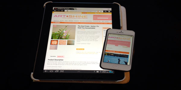
- Look and feel – First impressions count so you need to make sure your mobile website is as clear and as easy to view as your main website (standard PC Website) is. Ideally, the information in your mobile site needs to be presented stacked vertically unlike your standard PC website is horizontal columns (see above images). Your logo and headline appear centered in the top row. You can discuss the look and feel with your developer to make sure what it is that you want to show on the mobile site. This is a crucial stage.
- Text and images – Think about how your text and images could be shown clearly to the user. Particularly if you have shopping cart! How can you make it easy? If you don’t have clear features you audience will drop you and go to a competitors site that does offer a better mobile website experience.
- Install a browser re-direct feature onto your website – Ask your developer to install a re-direct feature so that if your customer is using a mobile device it will automatically take them to your mobile device site.
- Redesign key pages – Identify the key pages that you want to show on the mobile site. Highlight pages like “About us”, “Services”, and “E store” etc. You’ll want your services and products displayed on a website to be viewed in the clearest manner possible no matter what viewing device the consumer uses. The best way to get started is to find a developer who can convert your current site so that it can be seen clearly on different mobile devices. Your mobile device site is a “mini version” of your stand PC website.
- User experience – A good website not just looks pretty and colourful, it also needs to have great functionality and friendly navigation in place. You should have a call of action too so that you generate sales and leads for your business. Ask yourself this question… What is the main purpose of my website?
- Investing for the future – It is worthwhile for you to invest in a mobile device website now? It may cost you now however you will see the great benefit for your business in the years to come.
- Follow best practice for your mobile device site – Check out Google. It have a list of the best mobile marketing best practices that you could learn and apply to your mobile website.
Go to HowToGoMo.com.
So if you’re asking me if it would it be worth it to spend money on a mobile device website, I’d say yes, it would. And it is worth it for your to invest now as there is already a huge audience using mobile devices right now, and that will only increase in the years to come.
If you need help with your website you can contact Mark Kearns direct:
Email: mark.r.kearns@gmail.com
LnkedIN: http://www.linkedin.com/in/kearnsmark


